Busisness Card to be given at the Big C stores
I have tried to set up an exhibition of my work at the college, however there was no room for it anywhere. I decided to ask my client if I could use my photographs as a decoration on their store's widow displays. I have also planned to set up an exhibition at Open in April.
Knowing that many strangers will see my art I decided to design a business card.
I have also decided to create another businesses card with my real name due to my unit 4 employment project.
My aesthetic is build around nature and shapes. I Love moon and moon is a part of my art persona. Therefore I decided to use an image of a moon.
Unable to take photo myself I have looked at two websites from which I can download an image.
I have look at two different websites.
1. Istockphoto.com
(https://www.istockphoto.com/gb)
 I have found an image of a moon that I wanted to use, however if I wanted to use it, I would be charged £7 or above.
Unable to pay for an image I looked for another website. I have found Flickr. (https://www.flickr.com/)

I have found the right one and I saved it. I was not asked to pay for it.


The image:

To make the image more "mine" I have used Photoshop to edit it a little. I have mostly changed the brightness, contrast and vibrance of the image. I have also get rid of the background, because I want my businesses card to have a round shape and to have it only in the moon form.
Ways in which I tried to get rid of the background:
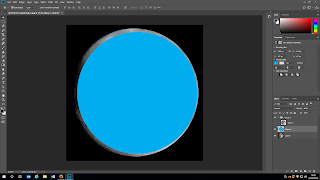
Here I tried to draw a circle on top of the moon to cut it out and have the perfect circle that I was going for, but then I realized that I only cover the moon with an extra image and that it does not make any sense.

Then I had a great idea. I decided to rub the background off. I could have used a tool that allows to draw around the shape and cut it out without the background, however I didn't feel like I have lots of control during that process. As you can see above, the outline is very harsh.

Above, you can see that I started to rub the background off.

It look a bit rough, but I changed the hardness of the rubber to very low, about 19% to get very soft line. And that worked.

Above, you can see, that the moon's outlines look soft and mostly round.
Fina effect
 When I finally had the shape and no background I went onto editing the image.

When the image was darker and lighter where I wanted it to be and when I increased the contrast and vibrance, I shared the image with my Iphone and edited the image there.
I have used app called: Pixlr.


The one above, with a single moon, I have used in the further design.
I came back to Photoshop. I added my logo onto the moon and lowered its opacity to match with the moon.

It looked kinda boring. In my art I always add triangles and other shapes. I thought I could be a good idea to use it this time as well.


Firstly I added a single triangle but I really did not like it. I felt like the lines were too wide. I decided to make them smaller.

As I did that, I have also made the shape of the triangle itself, look more like a drawing, so I did not link the lines in a neat way. I left the lines crossing each other to help with the illusion of having them hand drown onto the moon.
 I liked it much more. As I did with the logo, I have turned its opacity down to match with the rest of the design.
At this point I still felt like it was not good enough. I decided to add another triangle. Smaller this time.
 I have went for the same "rough" and "unfinished" look to make it look like it was hand drown. I felt like it looks a bit odd. I added another triangle.

I really liked it. I thought that maybe it would look nice if I add a white circle with no fill close to the edge of the moon. I was kinda inspired by an image that I found on pinterest:


I absolutely hated it and decided not to use it.
From that point on I moved on onto designing the back of the card. I wanted to have some kind of continuity going on. I decided to have the very same moon on the back as well. I also wanted to keep some of the triangles, but maybe in a different position. I did not want to change the font either.


I decided to go with the two small triangle.
I added text. What I do and my contact list. I do not have a website yet, but when I do I will add it into the list.

Firstly I used the font from the front of the card for everything on the back, but I felt like my emailed address and Instagram name are not very easy to read. I look for another font.
 I decided to use the font, that you can see above, as it is easier to read, but it still has a strong link to the other font.
After creating my art persona businesses card, I moved on onto creating a card with my real name.
There I met with some obstacles as my real name would not have the same symmetry as Luna Moon does.
 I did not like that one so I decided to place the moons on both ends of my name to give it a little bit more of the symmetry.


1st - the moons were too big. I shrink them and they look good with the rest of the design.
I moved on onto the back of the card, and the only thing that I changed, was my other email address, with my real name in it.
 In the end I had:
1. Luna Moon Card

 2. Ania Olesinska Card

 As much as I liked both designs I wanted to see how it would look like if I changed the back of the card a little - mainly the background, not the shapes or writing.
Firstly I decided to make it purely black. But I did not like it at all.

I decided to use my own photographs of the moon

This one was too dark


Here I like the lots of tree on the bottom of the circle, but I did not like how small the moon was.

Here I liked the moon, but there was too little trees.
I decided to put them together, like I have done previously on my workshops: https://creativeworkshops012.blogspot.co.uk/2018/01/the-levitation-and-multiplicity.html

I liked how it looked like and I decided to edit it a little bit by playing with brightness, contrast and the color balance.

Like previously, I decided to edit the image on my phone using the Pixlr app.


I did not like it as much as I did like the previous design. I end up not using those edits.
I did not think that the image will work with the layout that I designed. It would also disturb the continuity.
5th of March 2018
I went to the printing room at my college and I was told that they cannot prin my cards in a circular shape. Therefore I decided to put my logo on top of a black square, so it can be printed.


 Worried that it may be hard to read, I made the writing larger on the back of the cards:


The printed copies:

Knowing that many strangers will see my art I decided to design a business card.
I have also decided to create another businesses card with my real name due to my unit 4 employment project.
My aesthetic is build around nature and shapes. I Love moon and moon is a part of my art persona. Therefore I decided to use an image of a moon.
Unable to take photo myself I have looked at two websites from which I can download an image.
I have look at two different websites.
1. Istockphoto.com
(https://www.istockphoto.com/gb)

Unable to pay for an image I looked for another website. I have found Flickr. (https://www.flickr.com/)
There I have look through different photos.

I have found the right one and I saved it. I was not asked to pay for it.


The image:

To make the image more "mine" I have used Photoshop to edit it a little. I have mostly changed the brightness, contrast and vibrance of the image. I have also get rid of the background, because I want my businesses card to have a round shape and to have it only in the moon form.
Ways in which I tried to get rid of the background:

Here I tried to draw a circle on top of the moon to cut it out and have the perfect circle that I was going for, but then I realized that I only cover the moon with an extra image and that it does not make any sense.

Then I had a great idea. I decided to rub the background off. I could have used a tool that allows to draw around the shape and cut it out without the background, however I didn't feel like I have lots of control during that process. As you can see above, the outline is very harsh.

Above, you can see that I started to rub the background off.

It look a bit rough, but I changed the hardness of the rubber to very low, about 19% to get very soft line. And that worked.

Above, you can see, that the moon's outlines look soft and mostly round.
Fina effect


When the image was darker and lighter where I wanted it to be and when I increased the contrast and vibrance, I shared the image with my Iphone and edited the image there.
I have used app called: Pixlr.


The one above, with a single moon, I have used in the further design.
I came back to Photoshop. I added my logo onto the moon and lowered its opacity to match with the moon.

It looked kinda boring. In my art I always add triangles and other shapes. I thought I could be a good idea to use it this time as well.


Firstly I added a single triangle but I really did not like it. I felt like the lines were too wide. I decided to make them smaller.

As I did that, I have also made the shape of the triangle itself, look more like a drawing, so I did not link the lines in a neat way. I left the lines crossing each other to help with the illusion of having them hand drown onto the moon.

At this point I still felt like it was not good enough. I decided to add another triangle. Smaller this time.


I really liked it. I thought that maybe it would look nice if I add a white circle with no fill close to the edge of the moon. I was kinda inspired by an image that I found on pinterest:


I absolutely hated it and decided not to use it.
From that point on I moved on onto designing the back of the card. I wanted to have some kind of continuity going on. I decided to have the very same moon on the back as well. I also wanted to keep some of the triangles, but maybe in a different position. I did not want to change the font either.


I decided to go with the two small triangle.
I added text. What I do and my contact list. I do not have a website yet, but when I do I will add it into the list.

Firstly I used the font from the front of the card for everything on the back, but I felt like my emailed address and Instagram name are not very easy to read. I look for another font.

After creating my art persona businesses card, I moved on onto creating a card with my real name.
There I met with some obstacles as my real name would not have the same symmetry as Luna Moon does.


1st - the moons were too big. I shrink them and they look good with the rest of the design.
I moved on onto the back of the card, and the only thing that I changed, was my other email address, with my real name in it.

1. Luna Moon Card


Firstly I decided to make it purely black. But I did not like it at all.

I decided to use my own photographs of the moon

This one was too dark

This one was too empty.

Here I like the lots of tree on the bottom of the circle, but I did not like how small the moon was.

Here I liked the moon, but there was too little trees.
I decided to put them together, like I have done previously on my workshops: https://creativeworkshops012.blogspot.co.uk/2018/01/the-levitation-and-multiplicity.html

I liked how it looked like and I decided to edit it a little bit by playing with brightness, contrast and the color balance.

Like previously, I decided to edit the image on my phone using the Pixlr app.


I did not like it as much as I did like the previous design. I end up not using those edits.
I did not think that the image will work with the layout that I designed. It would also disturb the continuity.
5th of March 2018
I went to the printing room at my college and I was told that they cannot prin my cards in a circular shape. Therefore I decided to put my logo on top of a black square, so it can be printed.


The printed copies:

Comments
Post a Comment